Art Supplies · Minimalism

Prismacolor: The God of all Colored Pencils

DSC02637

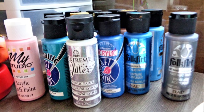
Alright, enough with the eternal paint questions that haunt my minimalistic dreams…

Onto the REAL stuff…rather, my favorite media when creating 2D art; colored pencils!  And my all time favorite brand: Prismacolors!

DSC02635

My experience with Prismacolors started a long long time ago when I used to steal my sister’s art supplies to color in my coloring books.  I loved using crayons but when I was really serious, I’d use her Prismacolors.  I also used Prismacolors to draw my first costume renderings.  As I went through school, I’d always be drawn to the brand but I wasn’t always able to use them the way I wanted.  The reason?  It was always so dang expensive!

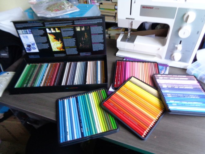
I’d purchase small sets but last year, I decided to take my overtime pay from work when we were finished with Halloween and buy the entire 150 count Prismacolor Premier. (I purchased mine from Dick Blick…the set is actually affordable from this particular website.  Here’s the page:  http://www.dickblick.com/items/20508-0150/ )  It was a whopping $95, but it was worth every penny.  I feel like the box should be set upon a golden pillow with a spot light shining upon it…

OK. Maybe not.  But I hold this brand to a very high standard.  This brand has a wide variety of markers, pastels, and colored pencils, but my experience comes from the Prismacolor Premier Colored Pencils.  Compared to the other colored pencils I’ve used in the past, this particular brand has the smoothest and vibrant hue I have seen in a colored pencil.  The only problem I have come across when using these pencils is how soft the lead is and what happens when one drops a pencil…you get chunks of lead that decides to break on you right when you are coloring that tiny little detail…

Another thing about this particular brand is how smooth the finished effect is.  You can purchase colorless blender pencils to help smooth the pigment onto the surface of your paper, making the pencil strokes disappear.

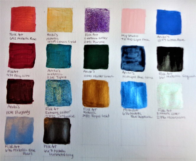
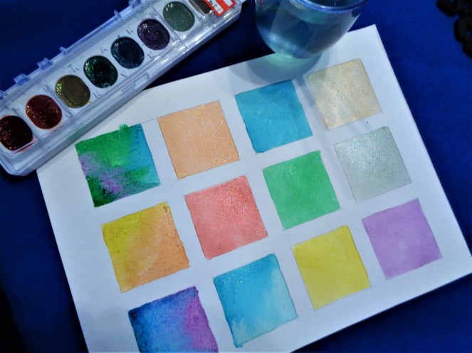
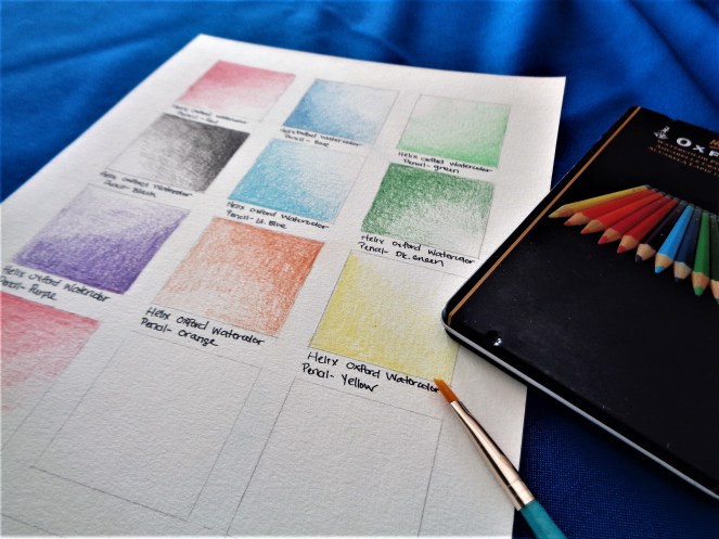
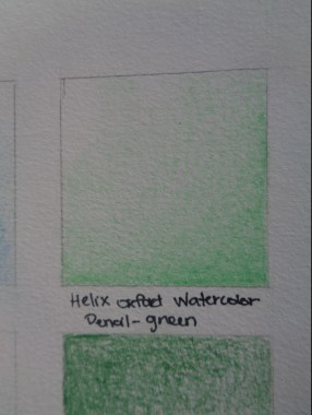
What is the relationship between Prismacolor and minimalism in my world?  Well…like the acrylic paint, it’s a complicated one.  I purchased this set last year and finally used them last week.  I was afraid to use this set because of how expensive it was.  I grew up not having these particular pencils because of the price.  Now that I finally was able to afford them, I didn’t touch them because…well…I don’t know why.  To me, minimalism is to use what you own.  To have these particular pencils up on a shelf collecting dust was to go against this idea I was trying to learn so that I can live by and make my life more meaningful.  So, just like I did with all my previous painting media, I created a swatch card.
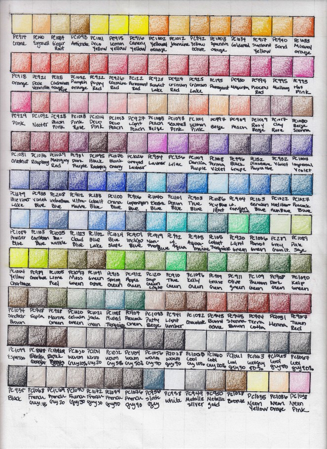
  IMG_20170828_0001 copy Aint it beautiful?

With every color, I got more and more excited.  I had to get over my fear of using my colored pencils.  But why did I have this fear?  Because I felt guilty that I wasn’t using these very expensive colored pencils on something magical and perfect.  And as I type that it sounds so silly.  I’m not perfect.  I know this.  But why am I putting my art, a product of me, to this such high pedestal?  There are dozens of more sticks of a particular color.  In fact, Prismacolor sells these colors in individual sticks (Black.  Enough said.)

So, after my swatch card was finished, I decided to test them out in a coloring book.  I purchased Selina’s Fenech’s ‘Goddess and Mythology Coloring Book’.  (You can purchase this coloring book here: https://www.amazon.com/Goddess-Mythology-Coloring-Fantasy-Selina/dp/0994585225/ref=sr_1_1?ie=UTF8&qid=1503970483&sr=8-1&keywords=goddess+and+mythology+coloring+book).  And started going to town.  I flipped the book to a particular page and started coloring.

IMG_20170828_0002 copy

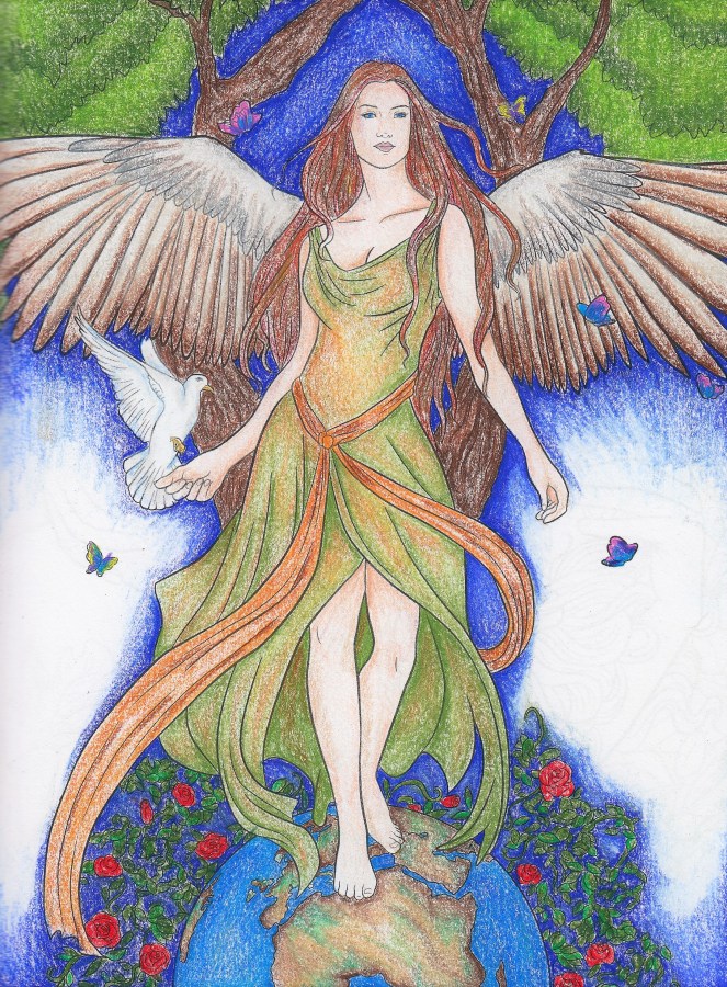
Gaia.  It’s a little less grainy in person, but the colors are just as bright and exciting. And I can’t wait to color more.

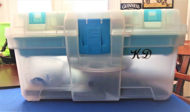
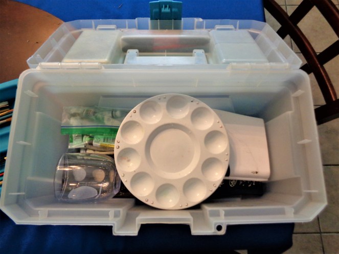
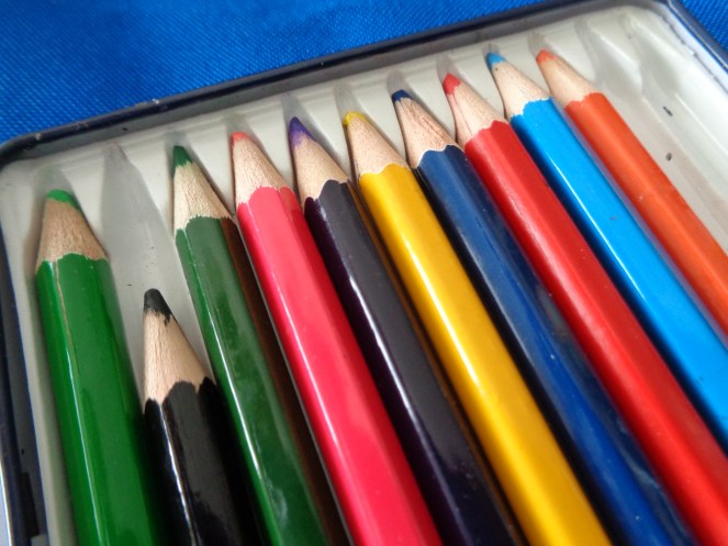
Another exploration of minimalism when it comes to this product.  I took apart the previous packaging for the paint to be broken into a smaller container so that I have a tangible, movable box.  I decided, because of how well designed this particular set is for function, to keep it in the same packaging.  In future blogs, I will explore my other brands of coloring media but I went ahead to break down the packaging so that I can have all my colors in one place.

Disclaimer:  I have not received any money from Amazon, Dick Blick, or Selina Fenech for mentioning their business name for the use of their products.  I just can’t say enough how awesome these products are.

Art Supplies · Minimalism

My (Silly) Complicated Relationship with Acrylic Paints

DSC02634 copy

Now that I have finished going through my watercolors, my next order of business to explore is my acrylic paints.  I approached my small set of acrylic paints with a little bit of hesitation because…well…I don’t like using them.  I never really used them in previous applications except for the random wooden art projects I have wanted to work on…and never finished. But I say I have a complicated relationship with them because as I tested them out in my usual way of drawn squares, I reacted more to the colors than I did to the actual paint.  I have always wanted to learn how to use the paint, hence the reason why I kept them.  Well…I tell myself that as an “art supply” hoarder. So, I tested out which paints based on color and quality.  I have various “Anita’s” and “Folk Art” Paints.  I have more metallic and glitter paint than I do normal colors.  I purchased these paints strictly on the color choices because I was drawn to the hues and tones. And who can say no to glitter?  It’s like magic.

Which brings me to “my silly relationship”.  As I went through my various acrylic paints, I struggled with getting rid of them.  I struggled because of the emotions I had with the colors and my desire to keep them.  I literally argued with myself about keeping the metallic and glitter paints.   So, this is a little bump in my art minimalism journey.  I purchased these items, and most of the items I am being overwhelmed with, based on emotions and the idea of creating something big and exciting using them.  And the frustrating thing is with this idea is that I never actually truly used them or finished a project while using them.

I decided to compromise with myself by keeping the paints I have these “emotional” attachment with and donating the colors that I see no need for.  And my conditions are that if I do not use them by January of 2018, then they will be thrown away.

Part of me feels as if I accomplished something but the other part feels like I’ve taken a step backward. It makes me feel uneasy but I think my step to moving forward is to accept this feeling because I need to understand why I’m feeling this way.

It’s also frustrating because my goal was to have the paint I decided to keep by keeping it in the paint tool box I mentioned in the previous post. But alas, I have one too many paint bottles that are preventing that.  That makes me reconsider getting rid of a few more paint bottles…but I have decided to stop obsessing over something silly like acrylic paints and move on.

Are there any minimalists artists out there who struggle with the emotions that art supplies can evoke and inspire ideas?  How do you deal with this?  Do you keep the tools that can help you create something that tells your story?  Or do you get rid of them because they take up space?  How do you cope with “the clutter” that causes the anxiety?  This whole purpose of this blog is my exploration of just that question.  And it’s silly because it’s just paint that started this question within myself…but it’s an object and that’s what part of minimalism that I’m exploring; simplification of objects.

I should just throw them all away…hmph.

DSC02631 copy.jpg


Art Supplies · Minimalism

Where to Put All My Watercolors?

It’s been a little while since I have written…went on a little vacation to Europe!  So, I had a chance to give my brain a little bit of a break…but now, I’m back to the drawing board…or, rather, the minimalism board!

I’ve been thinking about it…I can imagine someone coming across my board and reading my reviews about watercolors…how are the two related?  I have chosen to take the path of a more simplistic life…I’m following the ways of minimalistic thinking.  I’ve been holding onto so many things in my life…over the past few months, my husband and I have gotten rid of almost 15% of what we own….things we have been holding on to in our lives that have both a positive and negative meaning.  Overall, these objects have made our life more difficult.  So, the purpose of this blog is to go through things that have an artistic meaning in my life.  I have had the thought that my art gives my life meaning.  But as I go through the next chapter in my life, a wife, a manager, an artist, I understand that my art does not give my life meaning…it’s actually the other way around.  I give my art life and meaning.

Whoa.  That just got heavy.

But as I was painting and reviewing the watercolors in my art collection, I understand why I kept them…and why I should let them go.  I am basically giving permission to myself to alter my own possessions to make my life less complicated.

DSC00752

And what you see here ladies and gentlemen make my life more simple.  Yes, I understand that I still own this, but I never used my watercolors because it was never in one place.  I had several bags hanging out all over my sewing room…but now I have it in one toolbox where I can actually carry it to somewhere I can use it.  I can’t explain the sense of accomplishment when I actually condensed down my watercolors to one small box.  I can see all my things at once and see what my choices are.  Knowing that I was able to accomplish this small task gives me the confidence I can move on to another thing in my sewing room.  A small step to others but a huge step to me.

DSC00757 copy

DSC00756 copy

DSC00755 copy


Now onto everything else…my journey continues!

Art Supplies

Yasutomo Niji Watercolor Set Review


My next watercolor review is about the Yasutomo Niji watercolor 18 tube set.  This set is different than my previous sets because the watercolor pigment is in a tube.  To be honest, I had no positive expectation of this product…in fact, when I found it in my disorganized art supply pile, it had never been open, the plastic wrap was still on the box.  I have no memory of purchasing this watercolor set so I suspect my mom may have bought this years ago.  The price tag on the box lists that it was purchased at Hobby Lobby for $9.00.  The packaging on this box is an older version of it, so I didn’t think much of the watercolor would be usable because of the age.  I don’t even know anything about this brand. So, again, no positive expectations.

DSC00527 copy

DSC00528 copy

DSC00529 copy

But, I was wrong.  This brand of paint is actually not bad. It has a nice quality and covers the paper well for the price.  And it has a nice finished when dry; not grainy, but has a full texture.  I also liked the colors that came in this set; especially Naples Yellow.  Some times yellow doesn’t fair well in a cheaper watercolor set but this particular color had nice coverage.

DSC00536 copy

The only thing I encountered a problem was with the paint pigment itself.  Since the paint comes in tubes, the paint is supposed to be soft with a little bit of liquid in the paint so you can just squeeze it out onto a palette and immediately.  Most of the paints, the darker pigments, were already dried out due to the air that was it trapped inside the plastic tube.  So it was basically like the pigment that comes in the trays.  Except this pigment had sunk to the bottom of the tube and you had to squeeze the living daylights out just to get a tiny little bit.  The tubes also don’t help as these are formed plastic tubes (instead of a metal tube where you can actually squeeze the paint up to the top without having too much trouble and there isn’t any air trapped to affect the consistency of the paint.) Not all the paints had this issue though, some of the lighter pigments still had a nice semi-liquid appearance to it so it came out smoothly.

DSC00534 copy

Another thing I experienced that I’m not sure I’m a fan of is the fact that if you squeeze too much out of the tube, and don’t use all of it up, then you have extra left on your palette.  Normally not a problem, but if you don’t have extra palettes and and are limited in space, and you’re testing out other paints you have to wash away the extra paint, wasting it.  And I have a problem wasting paint because I feel guilty.  But with this particular blog, I’m exploring the needs and wants in my sewing room to become a more effective artist.  So, I’m in a conundrum.  What are your thoughts on this?  Do people have this same issue?  Do other artists deal with the guilt or don’t even acknowledge it?  It’s a strange thought, perhaps I’m over thinking this question, but I have this particular type of question and it stops me sometimes from moving forward, creating a mental, and sometimes, physical block.  But, when I think about it, I haven’t actually used the paint until now.  So…logical answer, wash it away so you can move forward.

DSC00531 copy

So, I’ve decided to keep this paint to experiment with it a little more.  If after a few times I use it and I decide I have better paints, then I’ll get rid of/donate this set.  It could go either way.  The only thing, though, that I did was get rid of the packaging.  As you can see in the first few pictures, the tubes come in a large plastic tray that just holds the tubes in place.  Some sets come with a place designed like a palette to mix the paints with water, but I didn’t see this in this set because all available spaces were not level.  In watercolor, you want a level area to mix your paints and add water because it gives you better control.  I also got rid of the packaging because I’m attempting to condense down and organize all my watercolors in one place…BECAUSE MINIMALISM.  I am currently organizing all my paints into a toolbox, which I’ll go over in another post.  But the packaging was taking up way too much space in that toolbox…and out it went.  Which introduces me to another question; how important is the packaging?  In this case, it’s not. The paints’ names are on the tubes.  In this case, I got a pencil case and am currently using this to keep all these particular tubes together.

Overall, these are good paints for beginners. In my personal opinion, there are other paints out there that are better.  So, let’s keep exploring!

DSC00533 copy


Art Supplies

Gansai Tambi Kuretake Starry Colors

DSC00511 Copy

Long time no see!  I’ve been away on a business trip for two weeks but now that I’m back, it’s back to the painting board! (Ha!  See what I did there? Um…nevermind…)

It’s time to review some paints I saw on a random Youtube review ages ago.  I’ve been staring and fondling the idea of getting the monthly subscription to the SketchBox monthly art subscription service but after much debate decided against it.  The idea here is to get rid of stuff…or at least use the product until I’ve used it all up.  But I did enjoy the idea of actually being introduced to new art products. So, instead of paying the monthly fee and adding more beautiful crap to my life, I decided to watch a few videos on some on the monthly boxes on Youtube.  I came across one particular one where someone was reviewing the Gansai Tambi Kuretake Starry Colors watercolor paints.  I’ve never heard of this Japaense based art company before and I was mesmerized.  Ok, I am a whore for anything glittery, but there was much more to this paint than the fact it was gold and had a metallic sheen to it.  Just by watching the one video, you could tell immediatly that this watercolor paint was high in quality and created a depth of color that watercolor sometimes do not exhibit.  Needlessly, the little magpie on my shoulder told me I needed to buy it.

One thing about these paints though, they are not cheap.  I reserached several different online art stores that sold them and finally set on purchasing them from Blitsy.com for $17.99.  I died a little though when I realized I was purchasing this set of paint for this amount for only 6 colors, but in the end, I decided that it was a good investment and I went for it.

The Gansai Tambi Kuretake paints are sold in various sets.  You can purchase a set of 36 paints for $50 and smaller sets for smaller amounts.  They have another “mettalic” set of pearescents pastels but this particular set seems to be more popular.

DSC00502 copy

Using Strathmore Watercolor cold press paper, I drew 2″ squares.  Looking at other watercolor reviews, many people like to create a long line of paint from concentrated to the lightest shade with mostly water to test and show the different aspects of the paint but I prefer to test my colors out in one bold square to get the richness of the paint.  Why?  Dunno, just do.

The paint pans come in a small rectangular box with a slide out tray.  The back details the numbers of the colors in the paint series and gives some instructions in several languages.  The coolest part of this box is the fact you can pull out the tray and pull out the little plastic paint trays.

DSC00498 copy

DSC00499 copy

The inside of the tray and the back of the smaller trays have the number listed so you can’t loose or misplace the colors.

One thing one reviewer mentioned about this particular paint is that it is easy to use, which I completely agree on.  You still maintain the quality that you need to be successful in using watercolors but it still is easy to use to get the color you want.

DSC00500 copy

The paints do have the usual qualities of watercolor and the transparency so if you want a more intense shade then you want to paint several layers to achieve that.  If you want to achieve that lighter shade, the paints will definitely allow you to do that.

Another positive quality that I particularly enjoy is that the paint dries quickly and with a nice sheen.  You normally don’t have a nice soft sheen on the finish of watercolors when they dry but this paint does have that.

Colors included in this set are the following; No. 901 Blue Gold, No. 902 Red Gold, No. 903 Yellow Gold, No. 904 Champagne Gold, No. 905 Light Gold, and No. 906 White Gold.

DSC00504 copy

DSC00505 copy

DSC00506 copy

DSC00507 copy

DSC00508 copy

DSC00510 copy

Overall, I recommend this brand of paint. It’s easy to use, the quality of the paint is high, and the colors are beautiful.  I’m looking forward to purchasing more colors of paint in the future.

If you are interested in this particular brand, I recommend looking at their website, www.kuretake.co.jp.  If you have any comments, positive or negative, please let me know.  I am very interested in learning more about this paint as I have never heard about this watercolor before while in Art school; I would have like to use this particular paint when I was rendering on a regular basis.

This is where I purchased my set of Starry Color watercolor;  https://blitsy.com/product/935257/kuretake-gansai-tambi-watercolor-starry-colors-set-of-6-2417/935257

Enjoy painting!

DSC00496 copy

Disclaimer:  I have not received any money or any other payment for recommending this brand of watercolor.  It’s just really neat and I wanted to share with the world!

Art Supplies

Prang Glitter Watercolor Paint: My Review

DSC00018 Edit

Hello again! I am continuing on my journey through my watercolor paints so that I can organize them and actually use them.  I came across my favorite watercolors and I am very excited to share with you the glitter!  I’m going to say it…but I love glitter and anything sparkly.  I swear I was a magpie in a previous life.

I introduce to you Prang Glitter Watercolor.  Remember the plastic box filled with the little oval pans filled with primary and secondary colors that you used in elementary school?  Well, this is that…glitterfied.  And yes…at 32, I still use this one.  Reason why?  Because, well, glitter.  I purchased this particular set when I started graduate school in 2009 because it was $2 on the Target clearance rack. I don’t use them often because in graduate school, it was frowned upon to use glitter on our costume design renderings.  I used them for fun; one project I used them for was creating watercolor blank cards for thank you notes.

But as I started a new test page, I forgot how much joy these watercolors gave me.  The joy came from little things while using the paints.  I loved how the paint looks in the small oval pans when water has saturated and thicken the watercolor paint.  DSC00024 Edit

And I loved how the paint dried; surprisingly there is an abundance of fine glitter (when you start painting correctly…more on that later…) and the colors are bright with a nice shiny sheen to the paint when dried.  The glitter doesn’t even come off when brushed when dry like some cheaper paints with glitter.

DSC00019 Edit

The Prang paints come in eight oval pans.  They come in a rectangle white box with no outer advertisement printed on the plastic.  I remembered when I bought this (and confirmed on the Internet on Amazon) the only printed information came on a cardboard wrap.  So, if you don’t keep this then you don’t have the company information listed.  I’m not sure of this is a good thing or bad; I didn’t know what company the paint came from until I opened the paints to see the word, “PRANG” in large spread out letters on the plastic surrounding the paints.  But, when using these particular paints, any other information about the paints weren’t necessary because the plastic box reminded me of what type of paints these were.  Which is good for the company because the brand becomes recognizable through the product itself (if you are familiar with the different types and quality of watercolor out there.) A small brush is included.  It’s ok to use the brush that comes with the pan but I prefer to use a more professional grade brush because of the bristles; less quality bristles tend to splay out from the base of the wood.

The eight colors that are included in this watercolor are Gold, Silver, Purple, Blue (my favorite shade, too!!!), Green, Yellow, Orange, and Red.  The fine glitter in each pan match the color in the pan with a little bit of iridescent glitter mixed in.

The key in being successful to using this paint is to add water to the pans and let the water saturate the pan and penetrate the paint for a few minutes before using the paint.  I suggest covering your brush (in less technical terms, just glop it on.) Unless you need a darker shade, one layer of this paint is bright enough to be efficient.  Another thing that I liked about using this paint is that it is easy to mix other colors together and shade well without the pigment separating, which sometimes happen with less expensive paint.

Overall, I recommend this paint for beginner and intermediate artists. (More experienced artists may want to use this paint too for its glitter effects, but I know there are other paints and mediums, like the iridescent mediums you can purchase to add sheen to any watercolor paint.) I recommend it because of it being easy to use and because it produces a nice smooth finish when dried.

And it’s glitter…and the paint water looks really cool after you aredone cleaning your brushes…GLITTER WATER… ‘Nuff said.

DSC00026 Edit

Please check out Prang’s Website for other products available. (www.prang.com)

Although I purchase mine at Target, you can purchase them at  Amazon.

Disclaimer:  I have not received any compensation from Prang to recommend this paint to anyone.  I just really like it…and GLITTER.

Art Supplies

Helix Oxford Watercolor Pencils: My Review

DSC00002 Edit

As I’m going through my sewing and art supplies I want to actually sample and see if it is something I want to keep or if it’s something I can use in the future, professionally or just for fun.

First thing I found in my stack of watercolor supplies was my Helix Oxford Watercolor Pencils.  I bought this set from Walmart ages ago.  There are 12 colors in the set; Red, Blue, Green, Black, Light Blue, Dark Green, Purple, Orange, Yellow, Pink…and two more…but guess what?  They have been lost…somewhere… They are kept in a thin metal tin.  I do not remember how much they cost.  Looking online, it looks like they are actually not made anymore and the date on the review I found is from 2009. Alrighty then…

If you are interested in purchasing them, you can get them on Amazon.

https://www.amazon.com/Helix-Oxford-Watercolor-Pencils-pack/dp/B002QD02FC/ref=sr_1_1?ie=UTF8&qid=1495413469&sr=8-1&keywords=Helix+Oxford+Watercolor+Pencils+-+12+pack 

Watercolor pencils are made just like colored pencils.  The pigment inside the wood reacts to water, just like any other watercolor medium.  However, with these pencils you can be specific on where they go, which is helpful when you aren’t experienced with watercolors.  Watercolor isn’t an easy medium to use; I definitely recommend practicing.  You can use these watercolor pencils two ways.  The first way is by drawing what you want to paint directly onto paper and applying water after.  If you choose to go about this way, I do recommend to watch the amount of water used and letting the area you want to paint dry before you move to the next area or you will get a big ugly mess with colors mixing. (Unless this is what you want, so go for it!). The other way is to wet the pencil and just go for it.  I’m not a fan of this method because of the condition of the pencil tip afterwards so I just draw and add water.  Regardless, watercolor pencils help create nice vibrant shading and I recommend them whenever possible because you have more control.  The only thing I do not like about watercolor is the limited possibilities of mixing colors. You can always add different types of watercolor together to create the desired effect but if you just have the 12 color set, you can mix colors by layers but colors won’t be as diversified.

DSC00007 Edit

In order to test out my Helix Oxford I created a grid of 2″ pencil boxes on watercolor paper (I just went to look up what type…and guess what?  I can’t find it . :-(.  And I just used it a few days ago…).  I took the color and notated it so that I have a reference when I want to use that specific color in the future.  I colored the boxes in such a way where one side was darker other side lighter to test shading.  Then I went over the box with water using a flat 1/4″ brush.

DSC00006DSC00011 Edit

First image is just the pencil shading.  Second image is the painted image.  You can still see the tooth of the pigment from the pencil on the grain of the watercolor paper, which is something you sometimes can’t avoid with watercolor pencils unless you dip the pencil in water and paint that way.

DSC00008 m

Overall, the coloring and painted went just as expected; it looks just like a colored pencil looks like when it is used on paper with a rough tooth (surface of paper).  And when the water is added, it looks like what watercolor should look like. I did notice one thing, the darker pigments would “collect” while drying.  See my black sample above.  I wet the entire box in one go.  As it was drying, it collected on the sides and the pigment grouped together.  Blue did it as well.  The lighter colors were smooth though.

Overall, these pencils did their job and I intend to keep them to use in my costume renderings for layering.  And I’m looking forward to locating the additional two colors (I have a feeling they are hiding in the colored pencil bins…). Since they were purchased from Walmart, I know they were not very expensive so I feel this set would be ideal for a student artist or someone beginning in watercolors.

In terms of organization, I intend to keep this set in it’s metal tin.  I have started a “paint toolbox.”  I had a leftover toolbox from graduate school that will now hold my paints. The thin tin will sit flat on the bottom of the toolbox utilizing space efficiently when thinking about minimalist art organization.  That’ll be another post when organizing my paint box.

Thanks for reading!

DSC00003

 Disclaimer: I have not received any compensation from the Helix Company to review any of thier products.